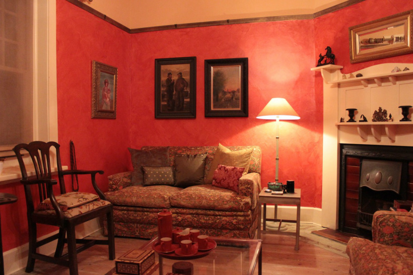
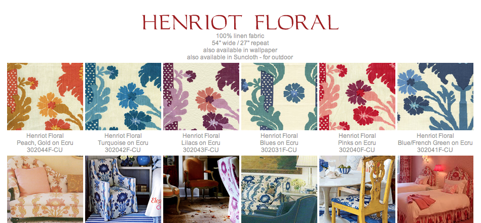
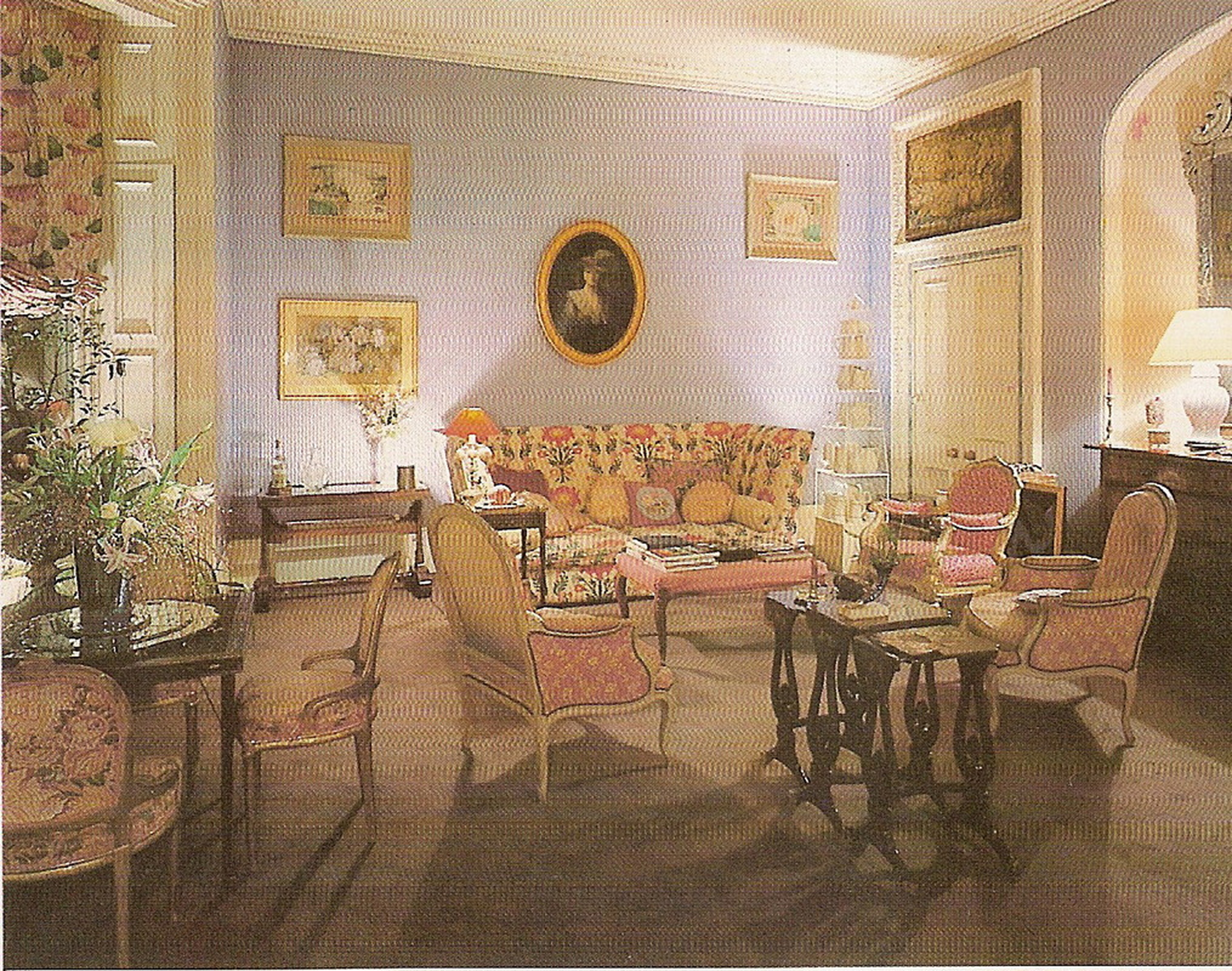
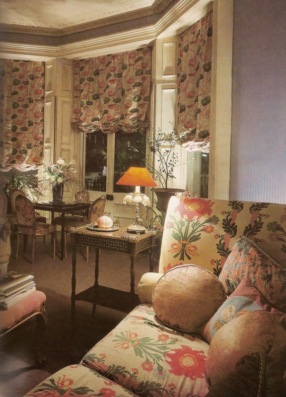
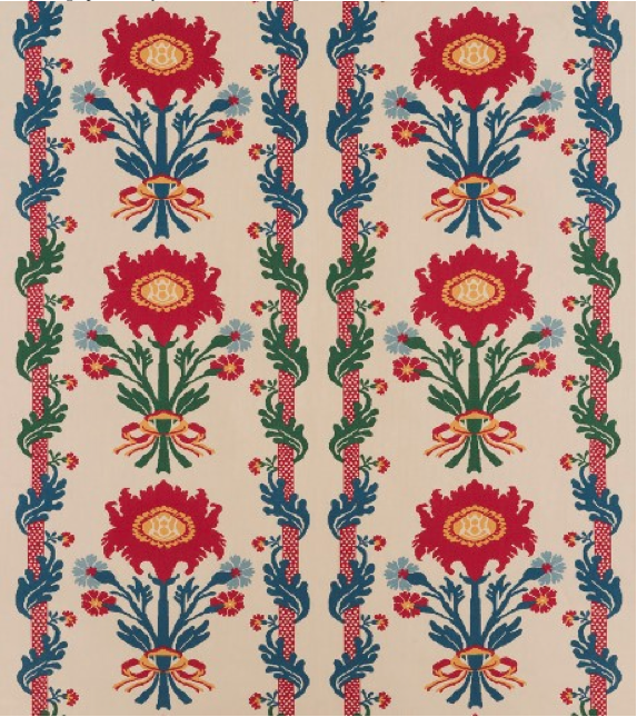
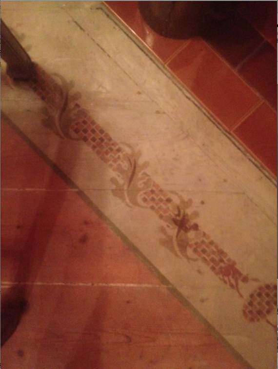
As you have now guessed I don't shy away from colour when it comes to design and decoration. While neutral colour schemes can be calm and soothing sometimes a bit more excitement is required. Our red sitting room is used mostly in the evenings to gather with guests before dinner. We wanted a glamorous wow effect for this space. We decorated this room back in 1988. It hasn't changed very much over the years. We started with the two two seater sofas covered in a Warner's linen called 'Chinese Panel'. The sofas inspired the red wall colour. The colour we wanted to evoke was laqauer red of a antique tray or reminiscent of Pompeii. The incandescent lighting and the red walls make everyone glow in this room. The walls are finished with a glazed 'broken colour' effect, that gives the colour both more depth and creates the illusion of space. To balance the rick red walls we used a soft gold coloured ceiling, off white skirting boards and timber work and bronze coloured picture rails. This room was the first one we did in this house. It was the room to escape to when the rest was a demolition and renovation site. It is furnished with an assortment of pieces from different eras. The coat cupboard was made by Max's grandfather in the 1920's. A three legged cricket table circa 1760 made from elm was my first antique purchase in my new job at Crichton Interiors many years ago. I decided to set a policy of each year buying an antique piece to slowly build a collection of treasured items. It came from Lee Harper Antiques in High street, Armadale. The country Chippendale carver Max bought from John Dunn Antiques. We covered it in a piece of crewel embroidered cotton that picks up the warm rust colour of the room. A pembroke table from C1790 holds a quirky collection of crystal bottle stoppers. They refract the light. A fur rug made from Fox paws covers the old pine floor, that we waxed to keep the colour soft. To add some modernity the brass and glass coffee table sits on the rug allowing the rug to be seen as well as Max's childhood collection of rocks and minerals displayed in a display case, also made by his grandfather. The paintings on the wall range from my dodgy fake 'our lady of the snow" 15th Century oil to early twentieth century New Zealand water colours, to an oil known as' the pirates and pumpkin people' from the mid 1970s. Defintely an eclectic mix. We added 'silken satin' curtains that spill onto the floor and lots of cushions in treasured fabrics, hand printed silk taffeta, patterned velvet, cotton damask and even a chintz pattern with a monkey in the design. This room is nicknamed 'monkey's room' as the Chinese Panel' fabric has little green monkeys in the design. I added a monkey cameo to the stencilled border on the floor and we found a bronze monkey candlestick.
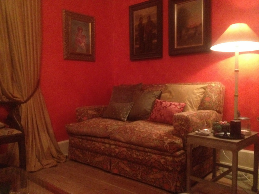
Rich red walls contrast with golden coloured 'silken satin curtains that theatrically spill onto the floor.The Warner's linen 'Chinese Panel' fabric inspired the red walls for this room. Hand printed silk cushions have napoleon bees and stars. I made these many years ago. The silk damask cushion is the most recent, it is a sample from Gainsborough Mills, England. The green silk cushion with the pearl buttons has bound button holes.
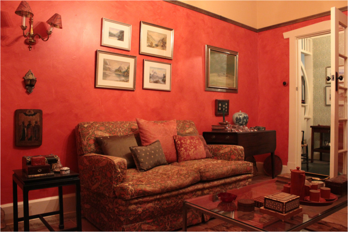
The room taken in daylight. The timber work is painted off white. The off white mounts in the water colours pick up the theme. Chinoiserie side tables hold little treasures including a tea caddy. The icon is the latest artwork added to the room picked up at Joel's auctions.
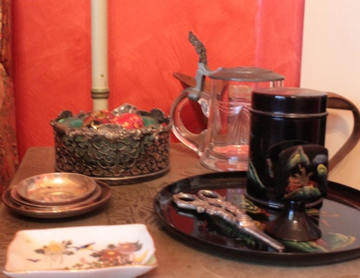
The little details on a stencilled side table include vintage lacquer and old silver.
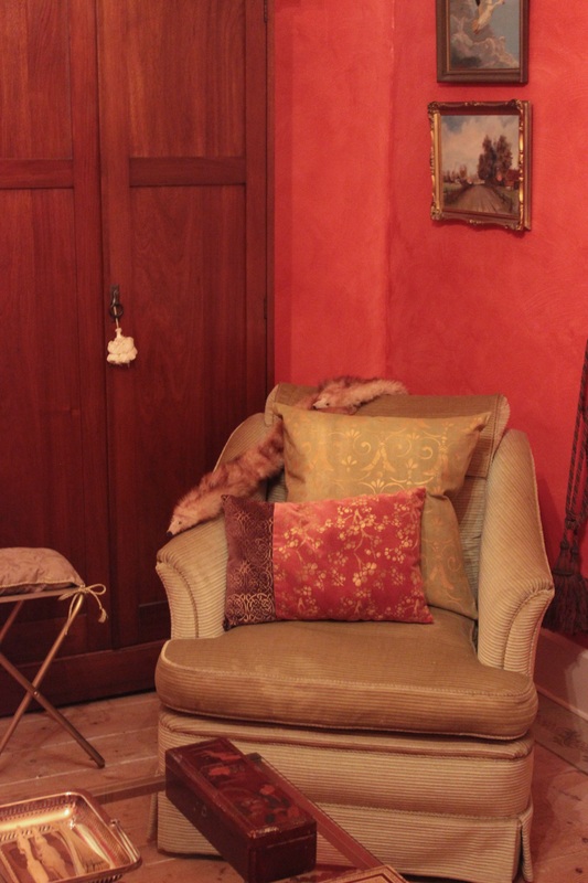
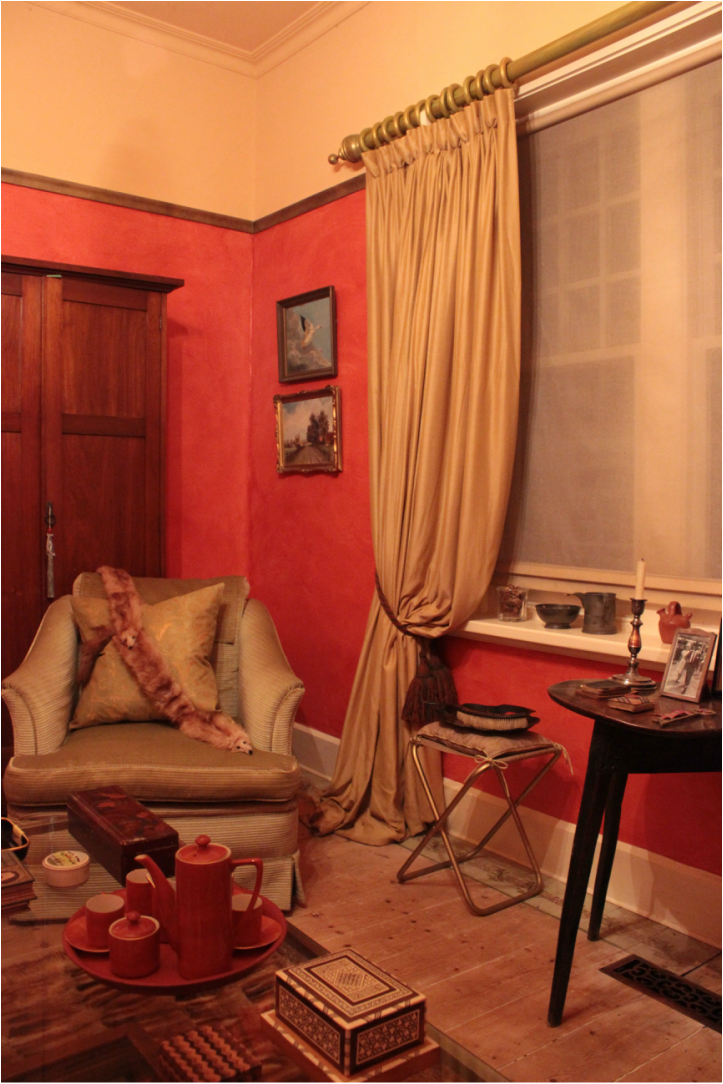
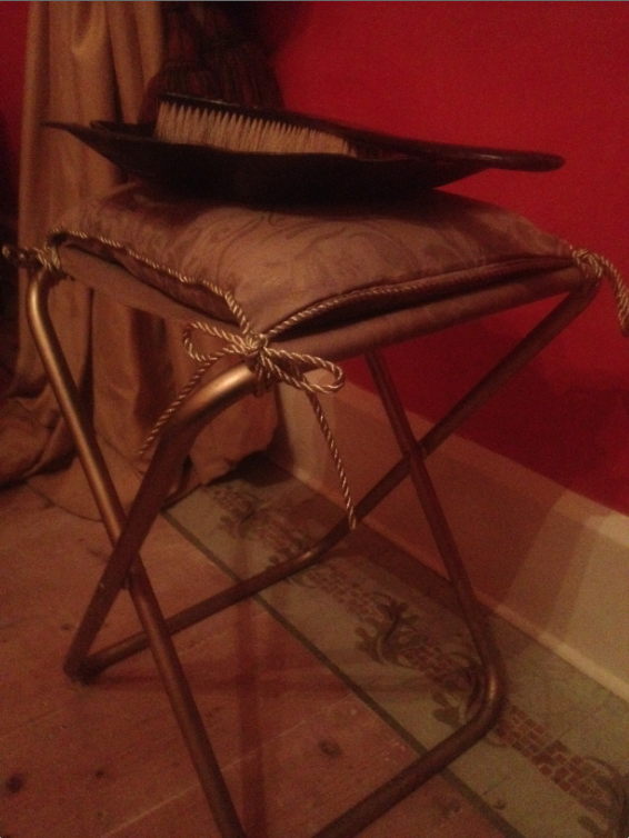
An 'Alexander Cook' upholstered armchair provides a place for hand printed cushions and a vintage fox stole. The little gold coloured folding stool is a place for guests to put their handbags. I adapted this idea from the Cipriani Hotel in Asolo.
You can see the pale gold drop/ceiling colour above the bronze picture rail. The curtains are down for cleaning in this shot, you can see the tiebacks. They are from Liberty of London another of my favourite companies. The Chippendale chair is silhouetted against the window.
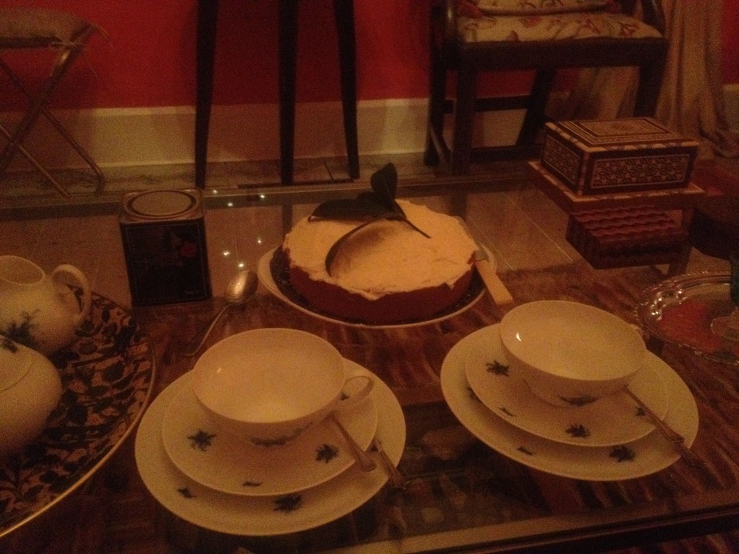
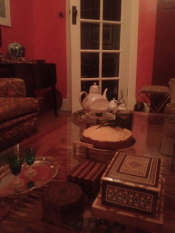
The terra cotta coloured coffee set was an opshop find. This room features a collection of boxes, some on the brass and glass coffee table. You can see this contrasts with the antique elm cricket table.
 RSS Feed